Case Study: SeventyFiverr
Catagory:
#UX/UI #Accessibility #Mobile UIType:
Academic ProjectDate & Time:
2022 Fall, 4 WeeksTeam:
Tim Chen, Mike Chu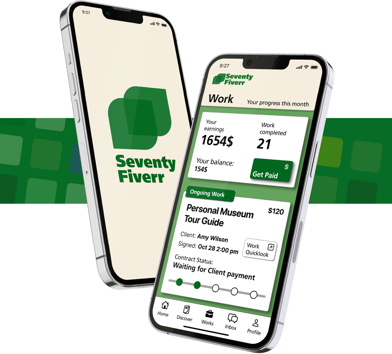
Overview
SeventyFiverr is a freelancer platform designed to connect retired elders with work opportunities and provide them with opportunities to contribute to society and earn additional income. On our app, elders can browse and take job requests and get paid in an elder-friendly interface.
We set our goal beyond the scope of a course project and tackled the real-world problem of helping elders facing financial hardship after retirement to have a respectable way to earn extra income
Project Information
This is the final project for my Interface Design course IAT334.
The project asked us to design an app for elders over 75.
My Role
- Generate this idea and set the overall design direction.
- Designing main interaction path and screens (Home, Discover, Works, Work detail, Contract).
- Justify the design with accessibility guidelines, evidence and theories.
- Create the interactive prototype with Protopie, an interactive prototyping tool.
My Takeaways
- Deep understanding of usability in UI elements and interactions, especially for elderly users.
- Applying critical thinking skills by solving real-life problems with creative solutions
- Experience in conducting UX research and usability interviews with users.
- Experience in creating high-fidelity interactive prototypes with Figma and Protopie
The Problem
- The aging population in the world will cause a heavy weight on the pension system.
- Elders with financial hardship often rely on their pension and are unable to change their situation because it's hard for elders to find a job after retirement.
- Elders still wish to contribute to their families and society after retirement.
- Current freelancing apps mainly target young users and not optimized for elders.
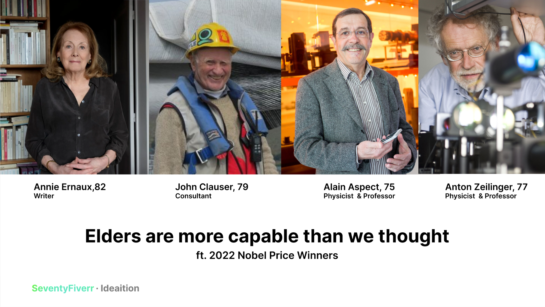
The Insights
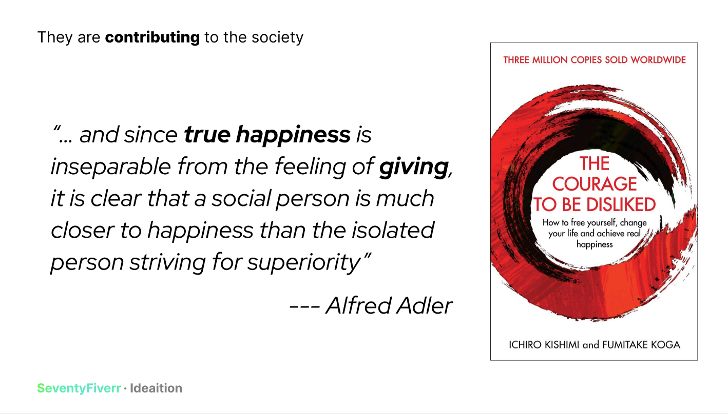
We tried to break the standard “elder app = elder care” stereotype, as insights reveal that elders can be just as capable as normal adults. Working also benefits elders mentally and physically, as it encourages them to stay active and have human interactions.
The Theory
Start
- We empathize with the problem and affected users by building user persona, exploring user senario, and identifying goals and pain points in the their current process. In this step we set the feeling in our app to be "Safety and Friendly".
- We breakdown the current process and identified the key interactions: Browse works, understand the work, trust the client, communicate and sign contract, and finally manage works and payments.
- I researched on current accessibility practices from established guidelines, heuristic principles and experience from the community, and set several rules to follow.
- We imagined from to create a "Safety and Friendly" impression by doing sketches and wireframes.
Key Ideas of design
- A blend of Flat 2.0 and Neo-brutalism to create to build the strong visual hierarchy with clear, bold text, depth created by slightly blurred drop shadow, and contents defined by clear borders.
- Use of Cards to catagorize function and information.
- Build high contrast according to the Web Content Accessibility Guidelines (WCAG)
- Through implementation of Usability Heuristics
Challenge: Scrolling
The use of "scrolling" is often avoided by designers when designing for elders as they are often confusing and less orienting, and we tried to avoid scrolling as much as possible. However, since most social media apps use scrolling as their main interaction, we can assume that current and future elders are more experienced in scrolling. Finally, we agreed that scrolls are acceptable and accessible with clear affordance.
Others Challenges
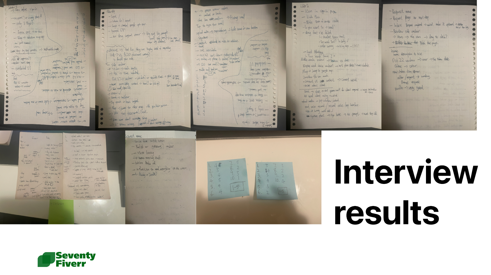
During designing the prototype we went into several problems in layouts, functions, wording and information structure. To gain deeper understanding of these problems I conducted 4 usability interviews.
Interviews
The interview is a truly valuable learning experience as it reveals a lot more real world problems beyond our prepared questions. I note down all the problems found, iterate our prototype, return to the testers, and polish the design untill there are no major usability issues. For example, we increased our default font size by 4 times.
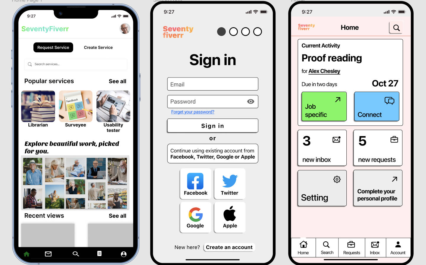
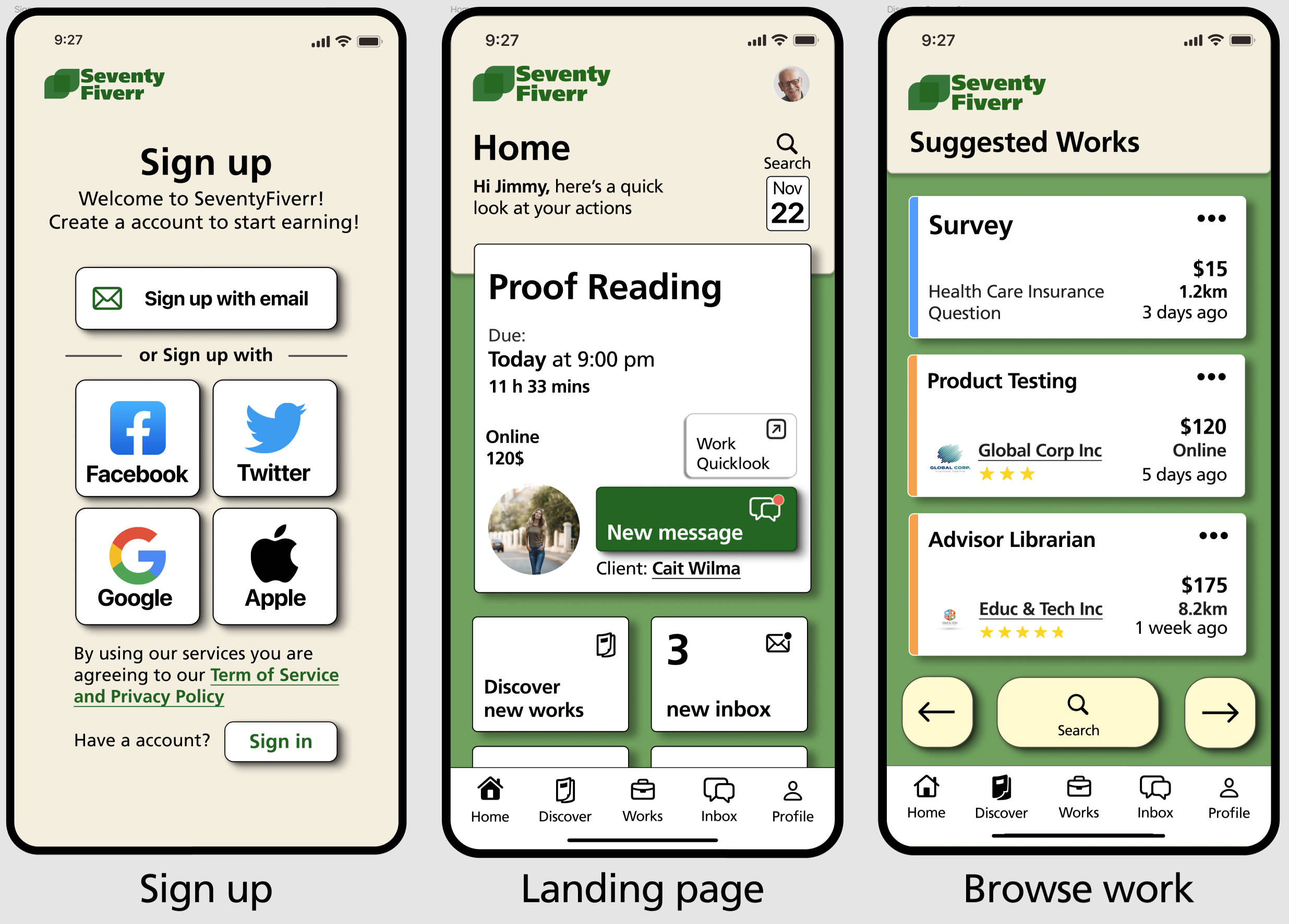
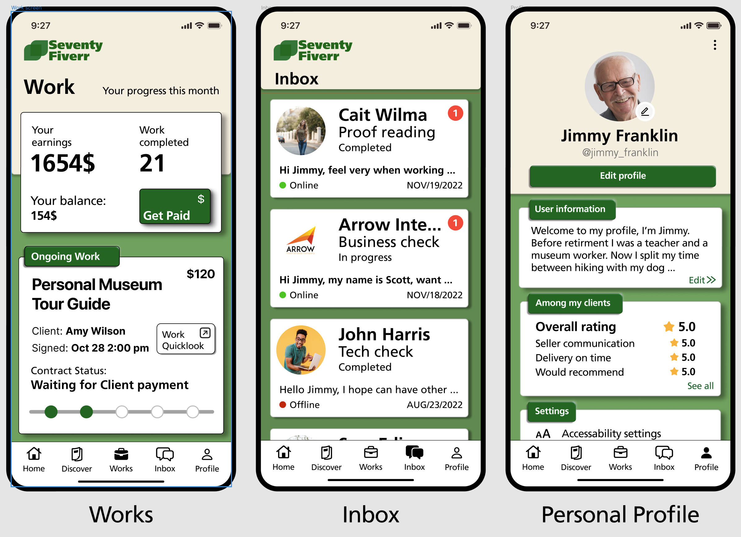
Final UIs
It's hard to design for maximum usability while keeping it aesthetically pleasing. But with the Final UIs, I hope there is a sense of "rightness". I did the main design of these pages while Mike also contributed creatively.
Interactive Prototype
Embeded & avaliable online, created using Protopie. To interact, Use mouse to click and drag.
Achievement
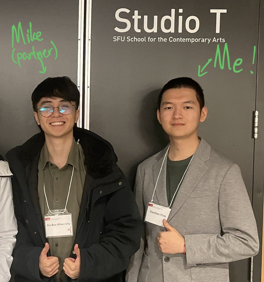
This project was featured in our school's 2022 Fall Showcase
This project was selected and presented at our Faculty's Annual Undergraduate Conference (SFU FCAT UGC 2023)